I think we're here - at the end of the archway - ha! ha!
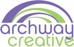
I see three options before me and you - see below! e for her and is unique. I do kind of like it, though I would like an actual "A" inside there somewhere (meaning the cross bar) - then it would feel a bit more complete to me. That could be kind of cool and still have the arch I like but it's less dominating. I might also go with the slightly thicker font or try some different ones for the rest of the letters - instead of the super thin font. But, that's the logo Wendy likes...
I see three options before me and you - see below! e for her and is unique. I do kind of like it, though I would like an actual "A" inside there somewhere (meaning the cross bar) - then it would feel a bit more complete to me. That could be kind of cool and still have the arch I like but it's less dominating. I might also go with the slightly thicker font or try some different ones for the rest of the letters - instead of the super thin font. But, that's the logo Wendy likes...
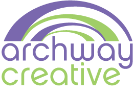
OPTION A: Original arch - one "word" execution, no link. One option for horizontal and just one for stacked. Could use the stacked one that is plain or the one below with linked y and c if I want.

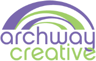
OPTION B: Horizontal logo with original arch - link between the two words to definitely show the link between archway and creative. Two options for horizontal - - slight difference in the link between the c and the y. One version for stacked (which is kind of fun - she did think I could use the intertwined y and c version with the original OPTION A above).

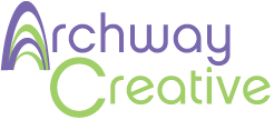
OPTION C: Using the arch as the "A" in archway. Wendy did not think cross bar worked b/c it cut the A and the arch. She changed the arches slightly to make the purple sort of appear as the crossbar forming the A.
OK, here's the LAST round of arches that had lost of options with the original arch.
Here's a link to the round of arches before that from Wendy - mostly single arches (of a different variety)
this was that original arch but with some very different fonts - most ruled out. click here
Here's a link to the round of arches before that from Wendy - mostly single arches (of a different variety)
this was that original arch but with some very different fonts - most ruled out. click here